librarian::shelf(
tidyverse
, PeruData
, lubridate
, ggalt
, cowplot
)
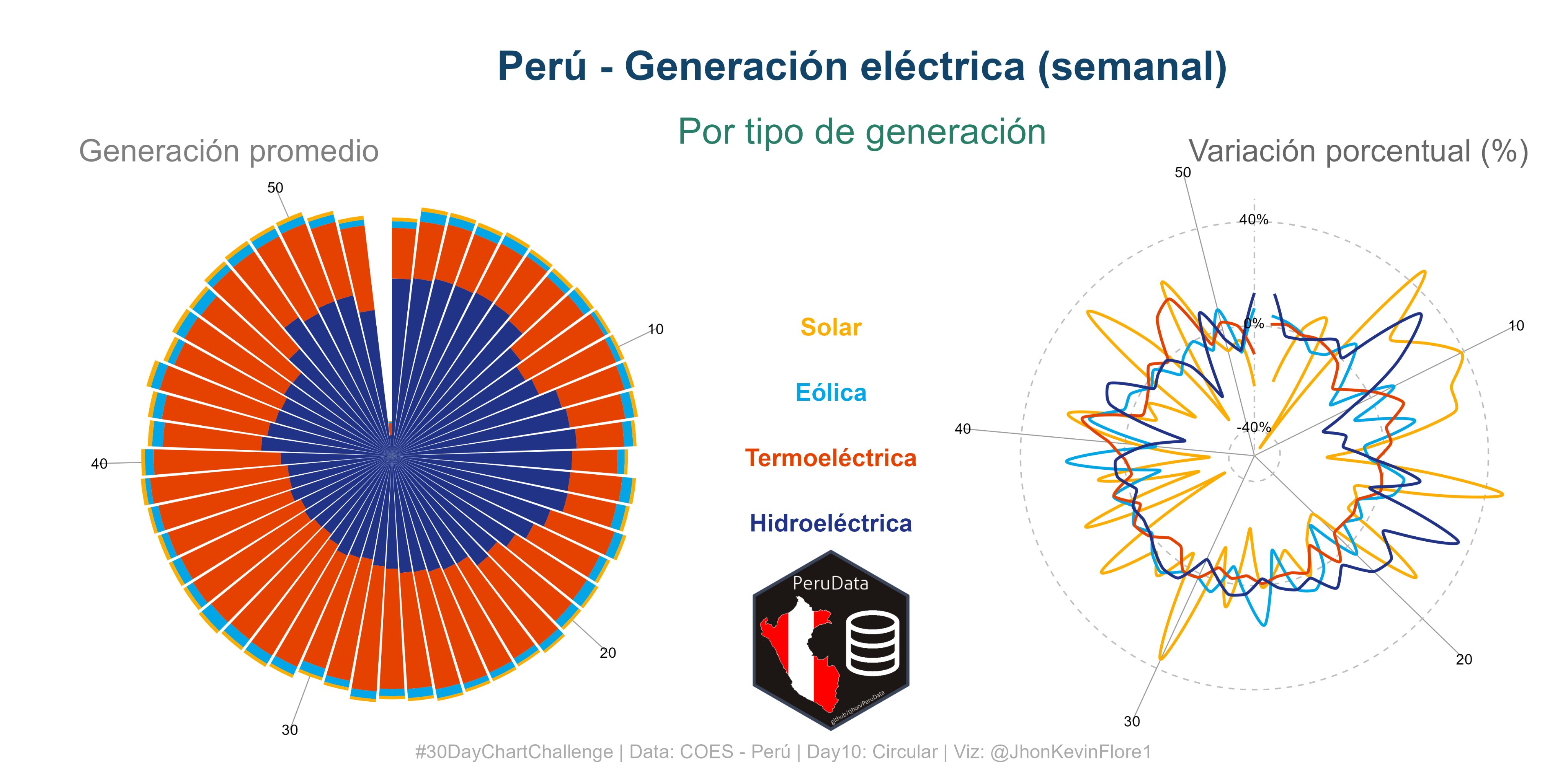
type_e <- c("Solar", "Eólica", "Termoeléctrica" , "Hidroeléctrica")
names(type_e) <- c(
"#fcad02"
, "#02a5e5"
, "#e54202"
, "#203387"
)
gen <-
PeruData::coes("generacion", start = "2021-01-01", end = "2021-12-31") |>
select(!2:3) |>
mutate(
fecha = dmy(fecha)
, tipo = str_to_sentence(tipo_generacion)
, sem = week(fecha)
) |>
select(!1:2) |>
group_by(sem, tipo) |>
summarise(total = sum(total)) |>
ungroup() |>
mutate(
tipo = factor(tipo, type_e)
)Day 11
R
Data Viz
ggplot2
Data analysis
COES
Day 11 from #30dataChartChallenge
m_c <- "gray"

main_theme <- function(...){


  # t <-
    theme_void() +
    theme(
      panel.grid.minor = element_blank()
      , panel.grid.major.x = element_blank()
      , axis.text = element_blank()
      , panel.background = element_blank()
      , plot.background = element_blank()
      , legend.position = "none"
    ) +
    theme(...)
  # t
}
p1 <-
gen |>
ggplot() +
aes(sem, total, group = tipo, fill = tipo) +
geom_col(
# position = "dodge"
) +
coord_polar() +
scale_fill_manual(
values = names(type_e)
) +
main_theme(
panel.grid.major.x = element_line(color = "grey60")
, axis.text.x = element_text(color = "black", hjust = 1)
)
p2 <-
gen |>
pivot_wider(names_from = tipo, values_from = total) |>
mutate(
across(2:5, lag)
) |>
pivot_longer(!sem, names_to = "tipo") |>
left_join(gen) |>
drop_na() |>
mutate(
cre = ((total - value) / value ) * 100
, tipo = factor(tipo, c("Eólica", "Solar","Hidroeléctrica" ,"Termoeléctrica" ))
) |>
ggplot() +
aes(sem, cre, group = tipo, color = tipo) +
geom_hline(yintercept = 0, color = m_c, linetype = "dashed") +
geom_hline(yintercept = -40, color = m_c, linetype = "dashed") +
geom_hline(yintercept = 40, color = m_c, linetype = "dashed") +
geom_vline(xintercept = 1, color = m_c, linetype = 4) +
geom_xspline(size = 1) +
ylim(-50, 50) +
scale_x_continuous(breaks = seq(0, 50, by = 10)) +
annotate("text", x = rep(1, 3), y = c(3, -37, 43), label = c("0%", "-40%", "40%"), vjust = 1) +
coord_polar(start = 0) +
scale_color_manual(values = names(type_e)) +
main_theme(
panel.grid.major.x = element_line(color = "grey60")
, axis.text.x = element_text(color = "black", hjust = 1)
)lbl <- function(n = 1, x = 1.06, y = NULL, z = 18
){
draw_label(
label = type_e[n]
, color = names(type_e)[n]
, y = y
, x = x
, size = z
, hjust = .5
, fontface = "bold"
)
}
p <-
ggdraw(xlim = c(0, 2), ylim = c(0, 1.2)) +
draw_plot(p1) +
draw_plot(p2, x = 1.1) +
draw_label(
"Perú - Generación eléctrica (semanal)"
, x = 1.1
, y = 1.1
, size = 30
, color = "#114468"
, fontface = "bold"
) +
draw_label(
"Por tipo de generación"
, x = 1.1
, y = 1
, size = 27
, color = "#277f68"
) +
lbl(1, y = .7) +
lbl(2, y = .6) +
lbl(3, y = .5) +
lbl(4, y = .4) +
theme(
plot.background = element_rect(
"white",
color = NA
)
) +
draw_label(
"Generación promedio"
, x = .1
, y = .97
, size = 23
, hjust = 0
, color = "grey50"
) +
draw_label(
"Variación porcentual (%)"
, x = 1.95
, y = .97
, size = 23
, hjust = 1
, color = "gray40"
) +
draw_label(
"#30DayChartChallenge | Data: COES - Perú | Day10: Circular | Viz: @JhonKevinFlore1"
, x = 1
, y = .05
, color = "darkgrey"
) +
draw_image(
"https://raw.githubusercontent.com/TJhon/PeruData/main/figs/PeruData-night.png"
, x = .96
, y = -.28
, width = .2
)ggsave(
'plots/day11_dcc_22.png'
, plot = p
, height = 8
, width = 16
)knitr::include_graphics('https://raw.githubusercontent.com/TJhon/30DayChartChallenge/main/Plots/day11.png')